| Sunday, October 1st, 2000 | #170 |
 |
|
| Introductions, Version 2.0 | A New Beginning |
|
|
||||||||||||||||||||||||||||||||||||||||||||||||||
|
|
|
||||||||||||||||||||||||||||||||||||||||||||||||||
|
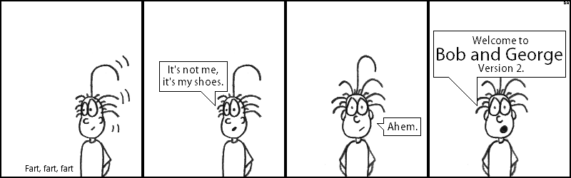
After spending two weeks off, during which I was supposed to be working on the comic, I returned with this comic. Overall, not a bad comic. A little sparse, especially if you're used to the rather colorful sprite comic, but not too bad. There were some things I had realized after my initial attempt at the hand-drawn comic that I wanted to make use of with this second attempt. For example, I realized that you can, in fact, copy and paste with hand-drawn comics. With the original hand-drawn comics, I had hand-drawn each element in each panel, even if it was repeated, which was time-consuming and slow. Here, I've clearly used the same basic George image in the first two panels and the second two panels, with minor adjustments based on the context. The downside to this, clearly, is that any imperfections in the image are copied as well, and it just plain looks lazy. Additionally, I realized that there's no need to show the entire figure in each and every panel. In a sprite comic, it comes quite naturally to show the entire sprite in the panel, but with a hand-drawn comic, there's no reason for it. With a hand-drawn comic you can show completely different angles and viewpoints if you so desire. This is evidenced here by only showing George from the waist up, mostly because I didn't feel like drawing his shoes. One significant difference between the first and second batch of the hand-drawn comics is the panel format. The first batch was a 2x2, with each panel being 300 pixels tall and 300 pixels wide; this second batch is closer to the sprite comic, with a 4x1 layout and each panel being 200 pixels wide but 250 pixels tall. This is a change I was planning to introduce back in July, as I felt I would need more vertical space, but not necessarily more horizontal space for the hand-drawn comic. But even with all of these changes and all the things I learned, I've just got to say, I find the second batch of comics less aesthetically pleasing than the first. I just don't like the way it looks, from the characters to actual line work. I think I actually got worse at drawing between the first and second batch, and that saddens me. Anyway, if you've ever owned a pair of Chuck Taylor's, I think you know what George is talking about in the first two panels. |
|
All material except that already © Capcom, © David Anez, 2000-2015.
This site is best viewed in Firefox with a 1024x768 resolution. This comic is for entertainment purposes only and not to be taken internally. Please consult a physician before use. |